Contents
1 Introduction
When I tried to use Google Spreadsheet’s form feature, I can’t have a chart exactly present the collected data in the way I want. Here is an example:
(You can read results here)
I want a chart (or datatable) tells me how many votes Cat earns, so to others. If you don’t have user-defined answer, then this can be solved by creating another sheet with COUNTIF function. That also is near unaccepted solution since that is totally manual handling and only suitable to having few answers.
I checked the Visualization API, and that do work. The trick is to use Google SQL-like Query Language:
select A, count(B) group by A order by count(B) desc
for a set of grouped data. Then we can use any appropriate Visualization APIs to render the data in specific way.
2 General Installation
- Grab the XML URI and import it (Insert Plugin…/Custom…) in Spreadsheet.
- Select proper data range
- Set the options
- Apply
- Publish to get JavaScript code for your webpages or add to iGoogle
3 Need a Hand?
3.1 Want Other Types or Small Changes?
I list my current gadgets in Gallery section, if they just happen to fit you need, then simply grab them. If not, you are welcome to discuss with me. I will try to help, please also provide:
- Sample spreadsheet (with test data, of course).
- If you can draw a final result by hand, please do. That would be easy for me to understand what do you want.
3.2 Also note
- Currently, these gadget is only for being imported in Spreadsheet, not (directly) in iGoogle page.
- I will try to generalize you needs to have more people to use.
3.3 Something is Broken
- Take a screenshot
- Allow me to read you spreadsheet (my Google account: livibetter(at)you_know_that)
- What would you be expecting?
- Leave me your email, gtalk, msn, or skype if you want.
4 Gallery
4.1 Pie chart using Grouped data
Features:
- Customization of Chart Title.
- Flexible to choice columns of grouped and aggregated.
- Choices of aggregation function: Max, Min, Count, Average, and Sum.
- Limit Results: Unlimited, 3, 5, 10, …
- Choices of legend type and position.
The data look like:

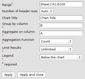
Gadget Options:

From the options above, the data range is A1:B100. Group By Column B, which is What Do You Love Most. Apply aggregation function Count on Column A, which is Timestamp. Here Timestamp acts like a dummy column, whose values are not important, but in order to count how many rows in a group, we need a column.
The live result:1
4.2 Datatable using Grouped Data
This gadget is similar to Pie chart, but a format of table.
Features:
- Flexible to choice columns of grouped and aggregated.
- Customization of column labels of grouped and aggregated result.
- Choices of aggregation function: Max, Min, Count, Average, and Sum.
- Limit Results: Unlimited, 3, 5, 10, …
The data look like:

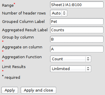
Gadget Options:

The live result:2
| [1] | <script src="https://spreadsheets.google.com/gpub?url=http%3A%2F%2Fdpheqr42-a.gmodules.com%2Fig%2Fifr%3Fup__table_query_url%3Dhttps%253A%252F%252Fspreadsheets.google.com%252Ftq%253Frange%253DA1%25253AB100%2526headers%253D-1%2526key%253DpHEPKEMm_zqEAhX7YbI5HVQ%2526gid%253D0%2526pub%253D1%26up__table_query_refresh_interval%3D0%26up_chartTitle%3DPets%2520We%2520Love%26up_groupBy%3DB%26up_aggregateOn%3DA%26up_aggregationFunction%3Dcount%26up_limitResults%3D0%26up_legend%3Dbottom%26url%3Dhttp%253A%252F%252Fyjl.googlecode.com%252Fsvn-history%252Fr6%252Ftrunk%252FGoogleGadget%252Fpie-chart-grouped.xml&height=322&width=361"></script> is gone. |
| [2] | <script src="https://spreadsheets.google.com/gpub?url=http%3A%2F%2Fdercb0pm-a.gmodules.com%2Fig%2Fifr%3Fup__table_query_url%3Dhttps%253A%252F%252Fspreadsheets.google.com%252Ftq%253Frange%253DA1%25253AB100%2526headers%253D-1%2526key%253DpHEPKEMm_zqEAhX7YbI5HVQ%2526gid%253D0%2526pub%253D1%26up__table_query_refresh_interval%3D0%26up_groupColumnLabel%3DPet%26up_aggResultLabel%3DCounts%26up_groupBy%3DB%26up_aggregateOn%3DA%26up_aggregationFunction%3Dcount%26up_limitResults%3D0%26url%3Dhttp%253A%252F%252Flivibetter.googlepages.com%252Fdatatable-grouped.xml%253Fnocache&height=323&width=361"></script> is gone. |
0 comments:
Post a Comment
Note: Only a member of this blog may post a comment.